CSS 实现渐变字

先来下前置知识。如果想速通,也可指直接到渐变字实现
什么是渐变
CSS3 渐变(gradients)可以让你在两个或多个指定的颜色之间显示平稳的过渡。
以前,你必须使用图像来实现这些效果。但是,通过使用 CSS3 渐变(gradients),你可以减少下载的时间和宽带的使用。此外,渐变效果的元素在放大时看起来效果更好,因为渐变(gradient)是由浏览器生成的。
渐变类型
渐变主要有三种类型:线性渐变( linear-gradient)、径向渐变( radial-gradient)、圆锥渐变( conic-gradient)
线性渐变
线性渐变创建了一条沿直线前进的颜色带。
1
| background-image: linear-gradient(direction, color-start, ..., color-end);
|
- 第一个参数为渐变方向
- 第二个参数为渐变起点
- 第三个参数为渐变终点
基础线性渐变
使用 linear-gradient函数,至少指定两种颜色即可(也被称为色标)
1
2
3
4
5
6
7
8
9
10
11
12
13
14
15
| .box1,
.box2 {
display: inline-block;
width: 400px;
height: 400px;
margin: 20px;
}
.box1 {
background: linear-gradient(red, blue);
}
.box2 {
background: linear-gradient(red, blue, purple);
}
|
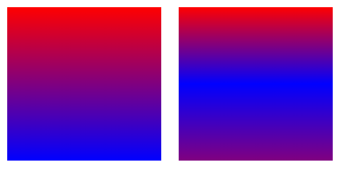
改变渐变方向
线性渐变的方向默认是从上到下,可以通过关键字 to改变渐变方向。
1
2
3
4
5
6
7
8
9
10
11
12
13
14
15
| .box1,
.box2 {
display: inline-block;
width: 400px;
height: 400px;
margin: 20px;
}
.box1 {
background: linear-gradient(to right, red, blue, purple);
}
.box2 {
background: linear-gradient(to bottom right, red, blue, purple);
}
|
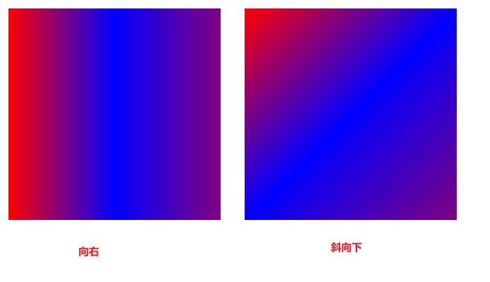
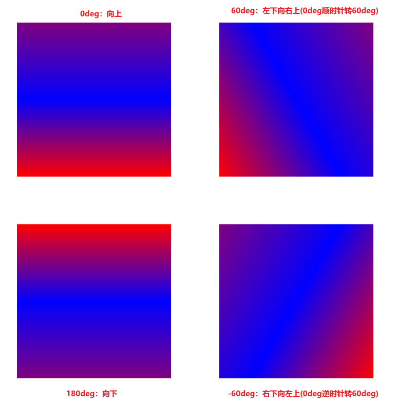
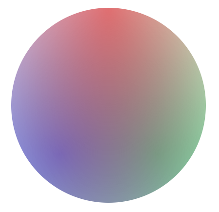
设置渐变角度
上面说了,可以通过关键字 to来改变角度,但是可选方向有较大限制。此时可以给渐变设置一个具体的角度。
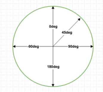
此图来自菜鸟教程
1
2
3
4
5
6
7
8
9
10
11
12
13
14
15
16
17
18
19
20
21
22
23
24
25
| .box1,
.box2,
.box3,
.box4 {
display: inline-block;
width: 400px;
height: 400px;
margin: 60px;
}
.box1 {
background: linear-gradient(0deg, red, blue, purple);
}
.box2 {
background: linear-gradient(60deg, red, blue, purple);
}
.box3 {
background: linear-gradient(180deg, red, blue, purple);
}
.box4 {
background: linear-gradient(-60deg, red, blue, purple);
}
|
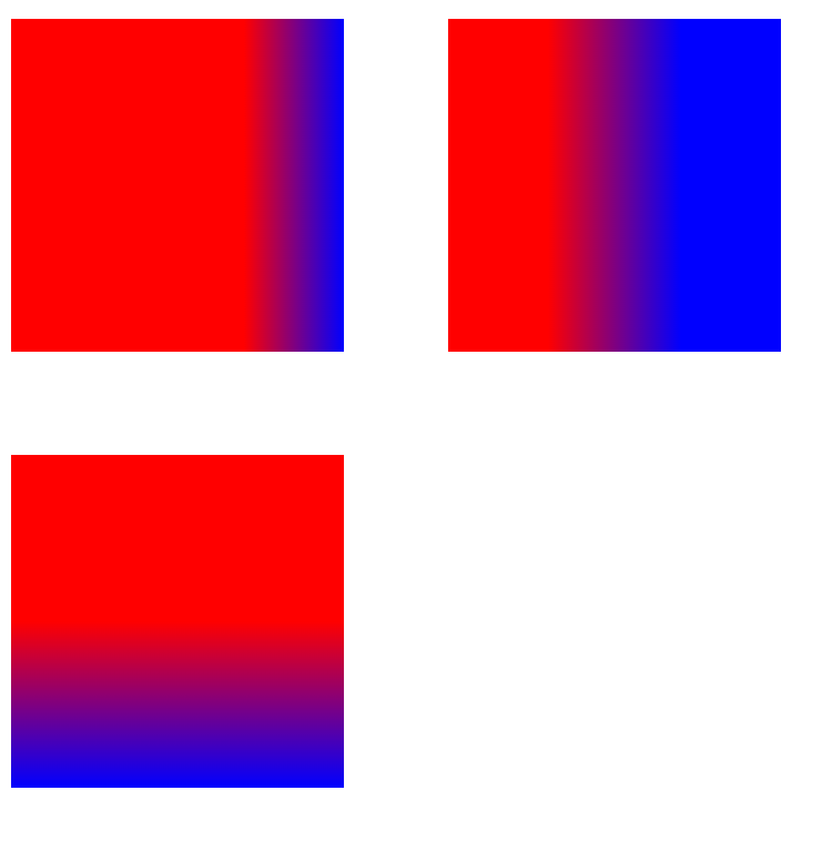
颜色终止位置
可以给颜色设置像素值或百分比等其他数值来调整位置。没有明确设置的话,会自动计算
1
2
3
4
5
6
7
8
9
10
11
12
13
14
15
16
17
18
19
20
| .box1,
.box2,
.box3 {
display: inline-block;
width: 400px;
height: 400px;
margin: 60px;
}
.box1 {
background: linear-gradient(90deg, red 70%, blue);
}
.box2 {
background: linear-gradient(90deg, red 30%, blue 70%);
}
.box3 {
background: linear-gradient(180deg, red 200px, blue);
}
|
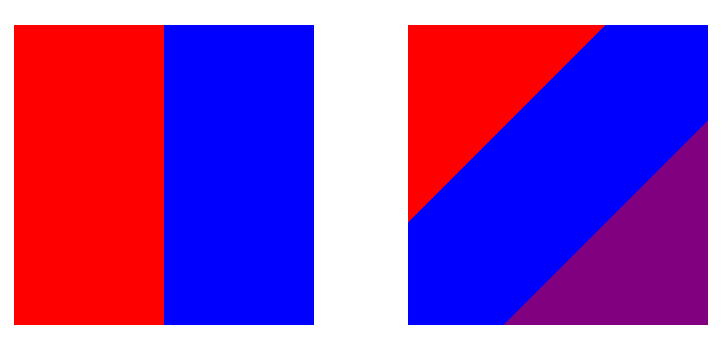
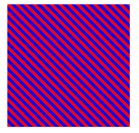
创建实线
根据颜色终止位置的知识点,很容易就能知道可以通过设置相邻的颜色的终止位置设置为相同即可
1
2
3
4
5
6
7
8
9
10
11
12
13
14
15
| .box1,
.box2 {
display: inline-block;
width: 400px;
height: 400px;
margin: 60px;
}
.box1 {
background: linear-gradient(to right, red 50%, blue 50%);
}
.box2 {
background: linear-gradient(135deg, red 33%, blue 33%, blue 66%, purple 66%);
}
|
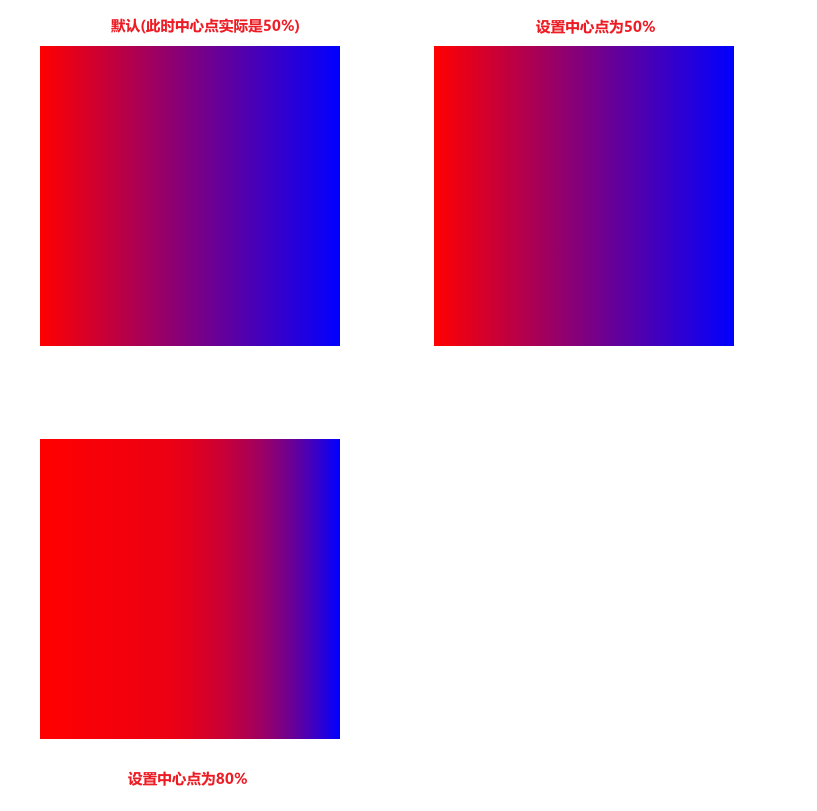
设置渐变中心点
默认情况下,渐变会平滑地从一种颜色过渡到另一种颜色。但是可以设置一个值修改渐变的中心点。
1
2
3
4
5
6
7
8
9
10
11
12
13
14
15
16
17
18
19
20
| .box1,
.box2,
.box3 {
display: inline-block;
width: 400px;
height: 400px;
margin: 60px;
}
.box1 {
background: linear-gradient(to right, red, blue);
}
.box2 {
background: linear-gradient(to right, red, 50%, blue);
}
.box3 {
background: linear-gradient(to right, red, 80%, blue);
}
|
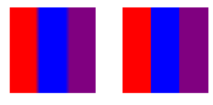
创建色带和条纹
要创建一个颜色的区域的话,一个颜色需要两个位置,这样子,这个颜色在两个颜色起止点都将会是完全饱和(即会保持该饱和度)。而和相邻的不同颜色还是正常的过渡。
1
2
3
4
5
6
7
8
9
10
11
12
13
14
15
16
17
18
19
20
21
22
23
24
| .box1,
.box2 {
display: inline-block;
width: 400px;
height: 400px;
margin: 60px;
}
.box1 {
background: linear-gradient(
to right,
red 30%,
blue 35%,
blue 65%,
purple 70%
);
}
.box2 {
background: linear-gradient(to right, red 33%, blue 33% 66%, purple 66%);
}
|
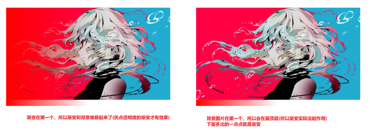
堆叠背景、渐变
渐变支持透明度,因此可以堆叠多个背景。背景从上到下堆叠,第一个指定在顶部
1
2
3
4
5
6
7
8
9
10
11
12
13
14
15
16
17
18
19
20
21
22
23
| .box1,
.box2 {
display: inline-block;
width: 400px;
height: 400px;
margin: 60px;
}
.box1 {
width: 800px;
height: 480px;
background: linear-gradient(to left, transparent 50%, red),
url("https://s2.loli.net/2022/03/09/8OjEFf5GQy6iTcm.png") no-repeat;
background-size: 800px;
}
.box2 {
width: 800px;
height: 480px;
background: url("https://s2.loli.net/2022/03/09/8OjEFf5GQy6iTcm.png")
no-repeat, linear-gradient(to left, transparent 50%, red);
background-size: 800px;
}
|
同理:渐变也是可以和其他渐变叠加的。
1
2
3
4
5
6
7
8
9
10
11
12
| .box1 {
display: inline-block;
width: 400px;
height: 400px;
margin: 60px;
}
.box1 {
width: 800px;
height: 480px;
background: linear-gradient(to left, transparent, red), linear-gradient(to top, transparent, blue);
}
|
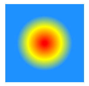
径向渐变
径向渐变类似于线性渐变,只是它们从中心点向外辐射。可以指定该中心点在哪里。也可以把它们做成圆形或椭圆形。
语法:
radial-gradient(center, shape size, start-color, ..., last-color);
- 第一个参数为渐变起点
- 第二个参数为渐变形状和渐变大小
- 第三个参数为渐变起点色标
- 第四个参数为渐变终点色标
基础径向渐变
1
2
3
4
5
6
7
8
9
10
11
12
13
14
15
| .box1,
.box2 {
display: inline-block;
width: 400px;
height: 400px;
margin: 60px;
}
.box1 {
background: radial-gradient(red, blue);
}
.box2 {
background: radial-gradient(red, blue, purple);
}
|
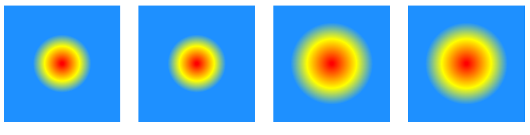
颜色终止位置
和线性渐变一样
1
2
3
4
5
6
7
8
9
10
| .box1 {
display: inline-block;
width: 400px;
height: 400px;
margin: 60px;
}
.box1 {
background: radial-gradient(red 10px, yellow 30%, #1e90ff 50%);
}
|
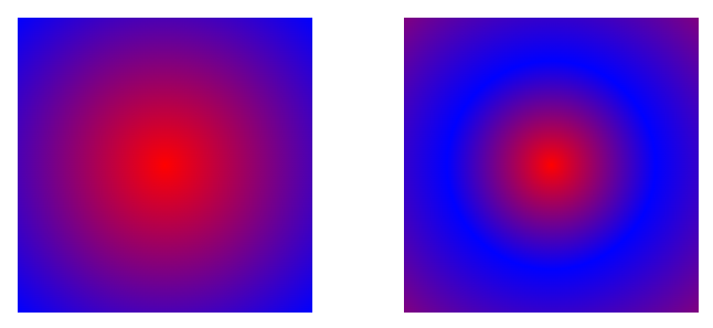
设置渐变中心
通过关键字at实现: 第一个参数是横轴,最左是 0%, 最右是 100%. 第二个参数是纵轴.
1
2
3
4
5
6
7
8
9
10
11
12
13
14
15
16
17
18
19
20
21
| .box1,
.box2 {
display: inline-block;
width: 400px;
height: 400px;
margin: 60px;
}
.box1 {
background: radial-gradient(at 0% 100%, red 10px, yellow 30%, #1e90ff 50%);
}
.box2 {
background: radial-gradient(
at 100px 200px,
red 10px,
yellow 30%,
#1e90ff 50%
);
}
|
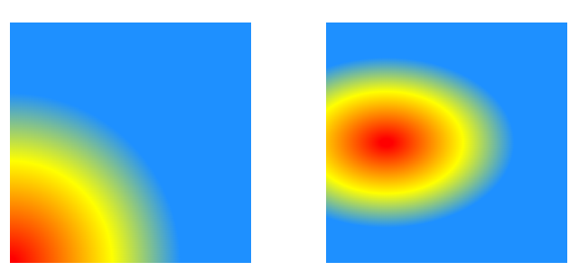
设置形状
shape 参数定义了形状。可以是值 circle 或 ellipse。其中,circle 表示圆形,ellipse 表示椭圆形。默认值是 ellipse
1
2
3
4
5
6
7
8
9
10
11
12
13
14
15
16
17
18
19
20
| .box1,
.box2,
.box3 {
display: inline-block;
width: 800px;
height: 400px;
margin: 60px;
}
.box1 {
background: radial-gradient(red 10px, yellow 30%, #1e90ff 50%);
}
.box2 {
background: radial-gradient(circle, red 10px, yellow 30%, #1e90ff 50%);
}
.box3 {
background: radial-gradient(ellipse, red 10px, yellow 30%, #1e90ff 50%);
}
|
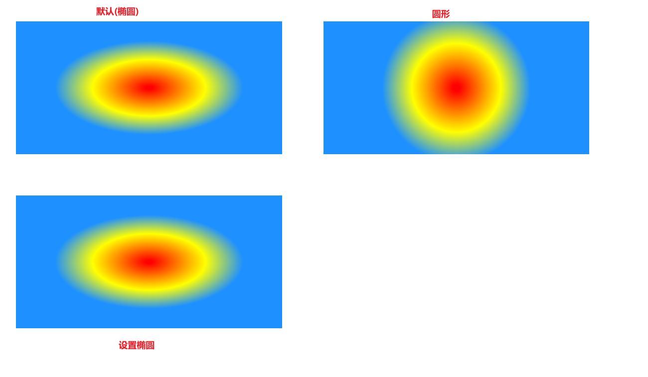
如果盒子是正方形,那么设置形状为椭圆可能不起效
设置渐变大小
size 参数定义了渐变的大小。它可以是以下四个值:
closest-side,指定径向渐变的半径长度为从圆心到离圆心最近的边farthest-side,指定径向渐变的半径长度为从圆心到离圆心最远的边closest-corner,指定径向渐变的半径长度为从圆心到离圆心最近的角farthest-corner,指定径向渐变的半径长度为从圆心到离圆心最远的角
默认值为farthest-corner
1
2
3
4
5
6
7
8
9
10
11
12
13
14
15
16
17
18
19
20
21
22
23
24
25
26
27
28
29
30
31
32
33
34
35
| .box1,
.box2,
.box3,
.box4 {
display: inline-block;
width: 800px;
height: 800px;
margin: 60px;
}
.box1 {
background: radial-gradient(closest-side, red 10px, yellow 30%, #1e90ff 50%);
}
.box2 {
background: radial-gradient(farthest-side, red 10px, yellow 30%, #1e90ff 50%);
}
.box3 {
background: radial-gradient(
closest-corner,
red 10px,
yellow 30%,
#1e90ff 50%
);
}
.box4 {
background: radial-gradient(
farthest-corner,
red 10px,
yellow 30%,
#1e90ff 50%
);
}
|
堆叠径向渐变
和线性渐变一样
1
2
3
4
5
6
7
8
9
10
11
12
13
14
15
16
| .box1 {
display: inline-block;
width: 800px;
height: 800px;
margin: 60px;
}
.box1 {
border-radius: 800px;
background: radial-gradient(
at 50% 0,
rgba(255, 0, 0, 0.5),
rgba(255, 0, 0, 0)
), radial-gradient(at 25% 75%, rgba(0, 0, 255, 0.5), rgba(0, 0, 255, 0)),
radial-gradient(at 75% 75%, rgba(0, 255, 0, 0.5), rgba(0, 255, 0, 0));
}
|
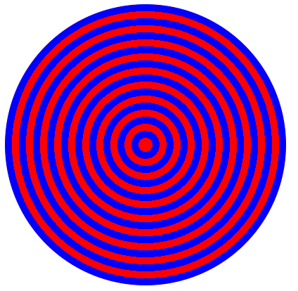
重复渐变
linear-gradient和radial-gradient属性不支持自动重复色标。但是,repeating-linear-gradient 和repeating-radial-gradient属性可用于提供此功能。
重复线性渐变
1
2
3
4
5
6
7
8
9
10
| .box1 {
display: inline-block;
width: 800px;
height: 800px;
margin: 60px;
}
.box1 {
background: repeating-linear-gradient(45deg, red 0 20px, blue 20px 40px);
}
|
看多难受,勿贪看。
重复径向渐变
1
2
3
4
5
6
7
8
9
10
11
| .box1 {
display: inline-block;
width: 800px;
height: 800px;
margin: 60px;
}
.box1 {
border-radius: 800px;
background: repeating-radial-gradient(red 0 20px, blue 20px 40px);
}
|
background-clip 属性
background-clip 设置元素的背景(背景图片或颜色)是否延伸到边框、内边距盒子、内容盒子下面。
border-box:背景延伸至边框外沿(但是在边框下层)。
padding-box:背景延伸至内边距(padding)外沿。不会绘制到边框处。
content-box:背景被裁剪至内容区(content box)外沿。
text:背景被裁剪成文字的前景色。(即文字的背景即为区块的背景,文字之外的区域都将被裁剪掉)
1
2
3
4
5
6
7
8
9
10
11
12
13
14
15
16
17
18
19
20
21
22
23
24
25
26
27
28
29
30
31
32
33
34
35
| body {
margin: 40px 0;
}
.box1,
.box2,
.box3,
.box4 {
display: inline-block;
width: 400px;
height: 400px;
line-height: 400px;
padding: 20px;
border: 20px dashed blue;
margin: 20px;
background-color: pink;
font-size: 80px;
text-align: center;
}
.box1 {
background-clip: padding-box;
}
.box2 {
background-clip: border-box;
}
.box3 {
background-clip: content-box;
}
.box4 {
-webkit-background-clip: text;
}
|
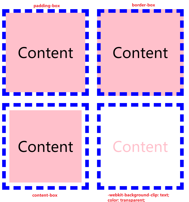
一眼望去,最后一个最特殊,所以要加上前缀 -webkit,好吧,原因并不是这样。网上有种说法是 background-clip: text; 只兼容 chrome,要想兼容其他浏览器就要用: -webkit-background-clip: text;。然而,我的 chrome 浏览器都需要-webkit-background-clip: text;才能实现。另外,文字的颜色应该设置为透明,否则会覆盖掉背景色。
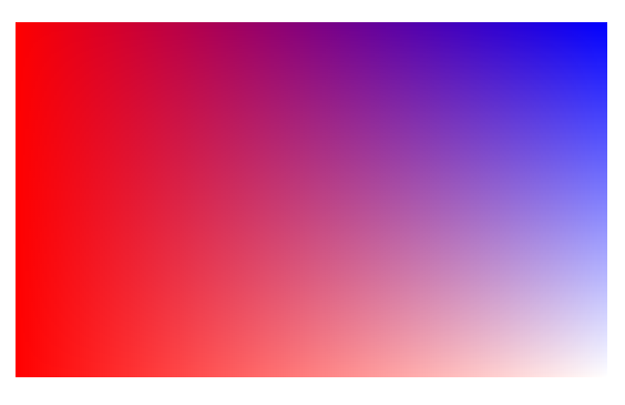
渐变字实现
看到这里,基本就能实现渐变字啦。
代码如下。
1
2
3
4
5
6
7
8
9
10
11
12
13
14
15
16
17
18
19
20
21
22
23
24
25
26
27
| <!DOCTYPE html>
<html lang="en">
<head>
<meta charset="UTF-8" />
<meta http-equiv="X-UA-Compatible" content="IE=edge" />
<meta name="viewport" content="width=device-width, initial-scale=1.0" />
<title>渐变字实现</title>
<style>
div {
background: linear-gradient(
to right,
rgb(255, 0, 0) 0%,
rgba(0, 0, 255, 0.8) 50%,
rgb(128, 0, 128) 80%
);
-webkit-background-clip: text;
color: transparent;
font-size: 400px;
text-align: center;
}
</style>
</head>
<body>
<div>赤蓝紫</div>
</body>
</html>
|

参考链接:
使用 CSS 渐变 - CSS(层叠样式表) | MDN (mozilla.org)
CSS3 渐变 | 菜鸟教程
CSS3 新特性概述_阿锐丫的博客-CSDN 博客_css3 新增特性