CSS布局(二)
等高布局
等高布局,顾名思义,就是指子元素在父元素中高度相等的布局。
开始之前,先看一个情境。
html代码
1
2
3
4
5
6
7
8
9
10
11
12
13
14
15
16
17
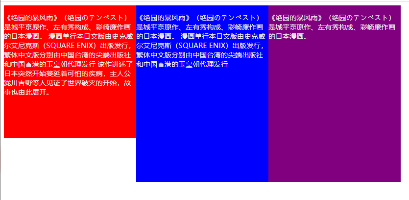
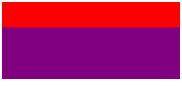
| <main>
<div class="left">
<p>
《绝园的暴风雨》(绝园のテンペスト)是城平京原作、左有秀构成、彩崎廉作画的日本漫画。
漫画单行本日文版由史克威尔艾尼克斯(SQUARE ENIX)出版发行,繁体中文版分别由中国台湾的尖端出版社和中国香港的玉皇朝代理发行
该作讲述了日本突然开始蔓延着可怕的疾病,主人公泷川吉野等人见证了世界破灭的开始,故事也由此展开。
</p>
</div>
<div class="center">
<p>《绝园的暴风雨》(绝园のテンペスト)是城平京原作、左有秀构成、彩崎廉作画的日本漫画。
漫画单行本日文版由史克威尔艾尼克斯(SQUARE ENIX)出版发行,繁体中文版分别由中国台湾的尖端出版社和中国香港的玉皇朝代理发行
</p>
</div>
<div class="right">
<p>《绝园的暴风雨》(绝园のテンペスト)是城平京原作、左有秀构成、彩崎廉作画的日本漫画。</p>
</div>
</main>
|
css代码
1
2
3
4
5
6
7
8
9
10
11
12
13
14
15
16
17
18
19
20
21
| main {
color: #eee;
}
main>div {
display: inline-block;
width: 300px;
vertical-align: top;
}
.left {
background-color: red;
}
.center {
background-color: blue;
}
.right {
background-color: purple;
}
|
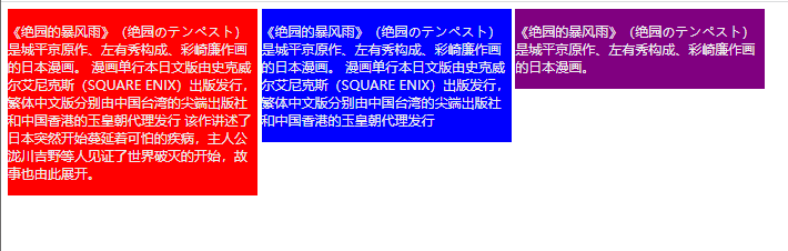
看着就有点突兀,这时候就需要我们的等高布局登场了。
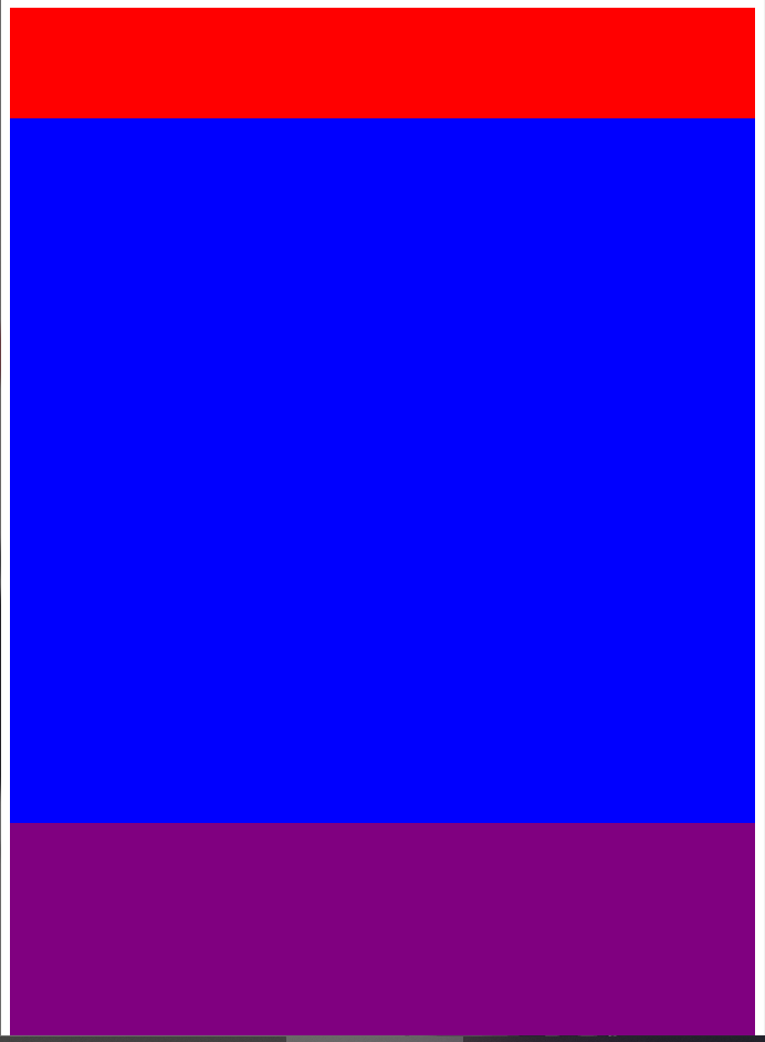
padding-bottom正值+ margin-bottom负值
- 先给子元素一个非常大的
padding-bottom
- 然后在给子元素添加同样大小的
margin-bottom负值
- 最后父元素设置
overflow: hidden,去掉多余的
1
2
3
4
5
6
7
8
9
10
11
12
| main {
color: #eee;
overflow: hidden;
}
main>div {
display: inline-block;
width: 300px;
vertical-align: top;
padding-bottom: 9999px;
margin-bottom: -9999px;
}
|
原理:
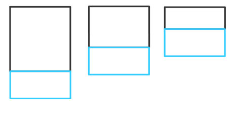
添加 padding-bottom后,如上图所示,此时的父元素的高度就是高度最大的子元素的高度,即上面第一个子元素的高度
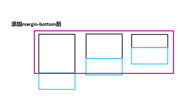
再添加 margin-bottom,值为 padding-bottom的负值,就会让父元素收缩成只有最高的子元素的高度
flex布局
因为flex布局,项目默认会拉伸为父元素的高度。当然,想让它不拉伸为父元素的高度也可以,只需要设置父元素 align-items来防止拉伸,因为 align-items是设置项目在侧轴的排列方式,默认值为 stretch,即会拉伸。
IE9以及IE9以下不支持。(没用过IE,要考虑老版本浏览器(过气浏览器)需要留意一下)
1
2
3
4
5
6
7
8
9
10
11
12
13
14
15
16
17
18
19
20
21
22
| main {
display: flex;
color: #eee;
}
main>div {
width: 300px;
}
.left {
background-color: red;
}
.center {
background-color: blue;
}
.right {
background-color: purple;
}
|
如果子元素高度,且不为 auto,那么此时用flex布局就不能实现等高布局
1
2
3
4
5
6
7
8
9
10
11
12
13
14
15
16
17
18
19
20
21
22
23
| main {
display: flex;
color: #eee;
}
main>div {
width: 300px;
}
.left {
background-color: red;
height: 300px;
}
.center {
background-color: blue;
height: auto;
}
.right {
background-color: purple;
height: 400px;
}
|
grid布局
实现比较简单,只需要设置父元素的属性 grid-auto-flow为 column即可,会自动规划好元素如何排列。
具体原理不太熟悉,暂时没研究出个所以然。(没学过grid布局,有空学一下,方法先写在这先)
1
2
3
4
5
| main {
display: grid;
grid-auto-flow: column;
color: #eee;
}
|
和flex优点像双胞胎的感觉:
table布局
利用表格中所有单元格高度都相等的特性。
1
2
3
4
5
6
7
8
9
10
11
12
13
14
15
16
17
18
19
20
21
| main {
display: table;
color: #eee;
}
main>div {
display: table-cell;
width: 300px;
}
.left {
background-color: red;
}
.center {
background-color: blue;
}
.right {
background-color: purple;
}
|
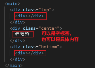
上下固定中间自适应布局
1
2
3
4
5
| <main>
<div class="top"></div>
<div class="center"></div>
<div class="bottom"></div>
</main>
|
定位法
上中下盒子都设置绝对定位。然后先让上盒子的 top设置为0,这时候就能实现上盒子固定了
1
2
3
4
5
6
7
8
9
10
| main>div {
position: absolute;
width: 100%;
}
.top {
top: 0;
height: 100px;
background-color: red;
}
|
接下来让下盒子固定,设置 bottom为0
1
2
3
4
5
| .bottom {
bottom: 0;
height: 200px;
background-color: purple;
}
|
最后,实现中间自适应,只需要设置 top为上盒子的高度, bottom为下盒子的高度即可。
1
2
3
4
5
| .center {
top: 100px;
bottom: 200px;
background-color: blue;
}
|
flex布局
利用 flex: 1划分剩余空间的特性,并配合 flex-direction: column切换主轴为垂直方向。
1
2
3
4
5
6
7
8
9
10
11
12
13
14
15
16
17
18
19
| main {
display: flex;
flex-direction: column;
}
.top {
height: 100px;
background-color: red;
}
.center {
flex: 1;
background-color: blue;
}
.bottom {
height: 200px;
background-color: purple;
}
|
结果发现,压根没起到中间自适应的效果。
分析以下原因:因为 main没有设置高度,且它的祖先元素 html、 body都没有设置高度,所以 main的高度就只有被上盒子和下盒子的高度撑开的那部分。既然如此,怎么可能还会有剩余空间呢?
经过上面的分析,我们发现 main的高度只有被上下盒子撑开的部分,所以我们需要依次给 html、 body、 main设置 height为 100%,这样子就可能一直继承屏幕的高度。这时候, main的高度就是屏幕高度,而中间占满剩余空间,也就是说中间自适应了。
1
2
3
4
5
| html,
body,
main {
height: 100%;
}
|
grid布局
利用 grid-template-rows属性设置每一行的高度,中间需要自适应则设置成auto
同理, html、 body、 main的高度都需要设置成 100%,去继承屏幕的高度
1
2
3
4
5
6
7
8
9
10
11
12
13
14
15
16
17
18
19
20
21
22
| html,
body,
main {
height: 100%;
}
main {
display: grid;
grid-template-rows: 100px auto 200px;
}
.top {
background-color: red;
}
.center {
background-color: blue;
}
.bottom {
background-color: purple;
}
|
table布局
父盒子 main设置 table布局,子盒子设置 display: table-row按行来分
1
2
3
4
5
6
7
8
9
10
11
12
13
14
15
16
17
18
19
20
21
22
23
24
25
26
27
28
| html,
body,
main {
height: 100%;
}
main {
display: table;
width: 100%;
}
main>div {
display: table-row;
}
.top {
height: 100px;
background-color: red;
}
.center {
background-color: blue;
}
.bottom {
height: 200px;
background-color: purple;
}
|
搞完了?
别太天真了
看似搞完了,实际没有搞完。
这是为什么呢?实际上 display: table-row就相当于是把 main下的 div都转换成 tr,而 tr内是必须要有内容的。
粘连布局
粘连布局:
- 当主体内容足够多时(即
main的高度足够大), footer紧跟在后面
- 当主体内容较少(小于屏幕高度),
footer粘连在屏幕的底部
html
1
2
3
4
| <main>
<p>主体内容</p>
</main>
<footer></footer>
|
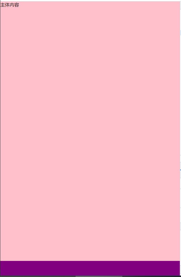
首先,我们需要主体内容较少时, footer粘连在屏幕底部。
所以主体盒子 main的高度应该为屏幕高度,然后给 footer设置 margin-top为自身高度的负值,让 footer上移到屏幕底部。
1
2
3
4
5
6
7
8
9
10
11
12
13
14
15
16
17
18
19
20
| html,
body {
height: 100%;
margin: 0;
}
p {
margin: 0;
}
main {
height: 100%;
background-color: pink;
}
footer {
height: 50px;
background-color: purple;
margin-top: -50px;
}
|
第一步完成,但是第二步还没实现,让我们来看看。
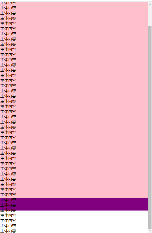
为什么?因为我们设置的 main盒子的高度为100%,也就是说当内容超过屏幕高度时就会溢出。所以我们不应该给 main盒子设置正常的高度,而应该设置最小高度 min-height,这样子当高度小时,就会是屏幕高度,而当高度大于屏幕高度时,高度还是正常的内容的高度。
而且,还应该给 main盒子设定 padding-bottom的值为 footer的高度,这样子就不会出现负 margin导致 footer覆盖内容。
1
2
3
4
5
| main {
min-height: 100%;
padding-bottom: 50px;
background-color: pink;
}
|
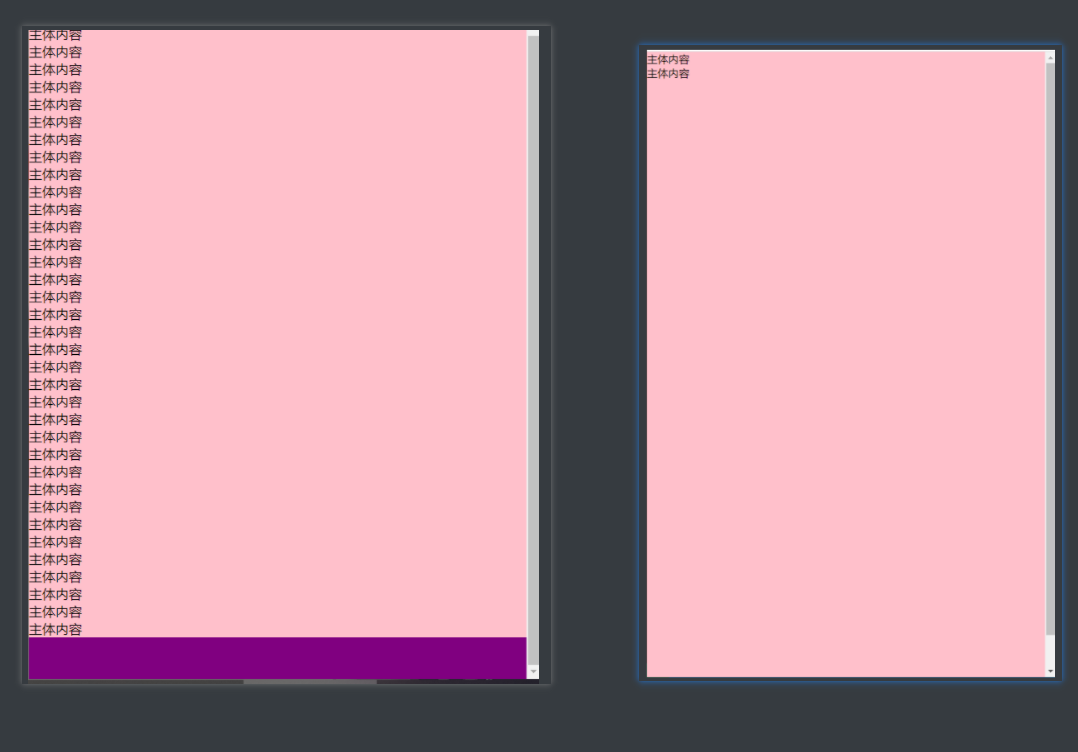
捡了芝麻丢了西瓜?
也不算,后面只要在再加一个小步骤就行了。首先呢?上面我们给 main盒子设置了 min-width: 100%,所以当内容很少时, main盒子的高度会是屏幕的高度,再加上一个 padding-bottom,那么就自然不能实现当主体内容较少(小于屏幕高度),footer粘连在屏幕的底部
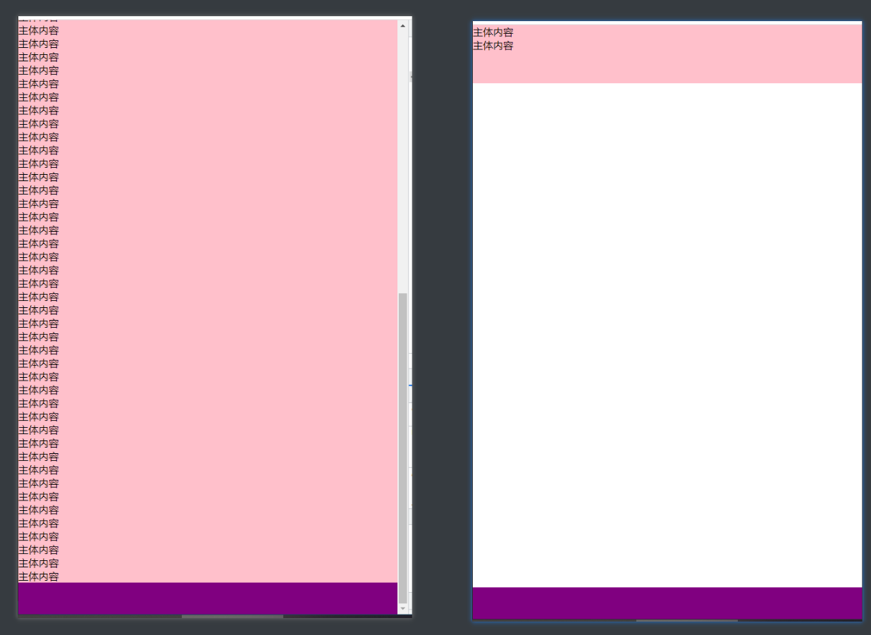
解决方案就是添加多一个外盒子 wrap把 min-height: 100%给 wrap而不是 main
1
2
3
4
5
6
7
| <div id="wrap">
<main>
<p>主体内容</p>
<p>主体内容</p>
</main>
</div>
<footer></footer>
|
1
2
3
4
5
6
7
8
| #wrap {
min-height: 100%;
}
main {
padding-bottom: 50px;
background-color: pink;
}
|
从上面的例子中,我们可以给 footer添加负 margin-top值来实现,而添加负 margin-top值只是为了让 footer能够让 footer上移到屏幕底部。所以不给 footer添加 margin-top负值,给 footer外的部分添加 margin-bottom负值也能得到同样的效果。
1
2
3
4
5
6
7
8
9
10
11
12
13
14
15
16
17
18
19
20
21
22
23
24
| html,
body {
height: 100%;
margin: 0;
}
p {
margin: 0;
}
#wrap {
min-height: 100%;
margin-bottom: -50px;
}
main {
padding-bottom: 50px;
background-color: pink;
}
footer {
height: 50px;
background-color: purple;
}
|
flex布局
还是老样子,利用flex布局项目的属性 flex会平分剩余空间的特性。
html
1
2
3
4
5
6
| <div class="box">
<main>
  <p>主体内容</p>
</main>
<footer></footer>
</div>
|
css
1
2
3
4
5
6
7
8
9
10
11
12
13
14
15
16
17
18
19
20
21
22
23
24
25
26
| html,
body {
height: 100%;
margin: 0;
}
p {
margin: 0;
}
.box {
display: flex;
flex-direction: column;
min-height: 100%;
}
main {
flex: 1;
background-color: pink;
}
footer {
height: 50px;
background-color: purple;
}
|
grid布局
有flex布局的地方怎么能没有grid布局(×?)。flex布局可以通过子项目的属性 flex来设置平分剩余空间,只有一个属性没有设置宽( flex-direction: row)或高( flex-direction: column)的时候,就是占满剩余空间。而通过 grid-template-rows可以设置每一行的高度,为 auto时是自动计算,为 1fr时是占满剩余空间
1
2
3
4
5
6
7
8
9
10
11
12
13
14
15
16
17
18
19
20
21
22
23
24
25
| html,
body {
height: 100%;
margin: 0;
}
p {
margin: 0;
}
.box {
display: grid;
grid-template-rows: 1fr 50px;
min-height: 100%;
}
main {
background-color: pink;
}
footer {
background-color: purple;
}
|
最后提一嘴:flex布局、grid布局真nb
参考链接: