居中对齐的几种方法
看面试题,自己总结了下,顺便写了对应例子,加深印象。
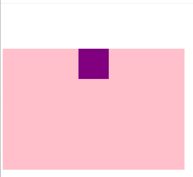
水平居中
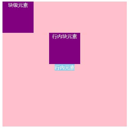
给 div设置一个宽度,再添加 margin: 0 auto
必须要添加宽度,只对块级元素有效
1
2
3
4
5
6
7
8
9
10
11
12
13
14
15
16
17
18
19
20
21
22
23
24
25
26
27
28
29
30
| <style>
.container {
width: 400px;
height: 400px;
background-color: pink;
color: #fff;
}
.box {
width: 100px;
height: 100px;
background-color: purple;
margin: 0 auto;
}
.inline-block-box {
display: inline-block;
width: 100px;
height: 100px;
background-color: purple;
margin: 0 auto;
}
</style>
<div class="container">
<div class="box">块级元素</div>
<span class="inline-block-box">行内块元素</span>
<br />
<span>行内元素</span>
</div>
|
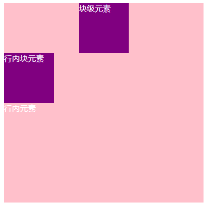
给父元素添加 text-aligin: center
只对行内块元素、行内元素有效
1
2
3
4
5
6
7
8
9
10
11
12
13
14
15
16
17
18
19
20
21
22
23
24
| .container {
width: 400px;
height: 400px;
background-color: pink;
color: #fff;
text-align: center;
}
.box {
width: 100px;
height: 100px;
background-color: purple;
}
.inline-block-box {
display: inline-block;
width: 100px;
height: 100px;
background-color: purple;
}
span {
background-color: skyblue;
}
|
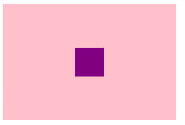
水平垂直居中
计算法
父元素跟着子元素 margin-top 移动问题
开始之前,先看下一个小问题
下面的例子中,我们想要让子元素离父元素有距离
1
2
3
4
5
6
7
8
9
10
11
12
13
14
15
16
17
18
19
| <style>
.container {
width: 600px;
height: 400px;
background-color: pink;
color: #fff;
}
.box {
width: 100px;
height: 100px;
background-color: purple;
margin: 150px auto;
}
</style>
<div class="container">
<div class="box"></div>
</div>
|
结果,子元素并没有外边距效果,反而是父元素出现了外边距的效果。
这是因为,根据规范,父元素的子元素的上边距( margin-top),如果碰不到有效的 border或者 padding,就会一层一层的找自己的祖先元素,直到找到祖先元素有有效的 border或border为止
解决方案:
- 给父元素添加
padding-top
- 给父元素添加
border-top
- 给父元素添加
overflow: hidden(推荐)
1
2
3
4
5
6
7
8
9
10
| .container {
width: 600px;
height: 400px;
background-color: pink;
color: #fff;
overflow: hidden;
}
|
开始
首先 margin左右可以直接设置 auto实现居中,但是的上下不行。
计算法:margin上下值 = (父元素高度-子元素高度)/2
在这个例子中,父元素的高度为 400px,子元素的高度为 100px,所以 margin上下值设置为 150px
1
2
3
4
5
6
7
8
9
10
11
12
13
14
| .container {
width: 600px;
height: 400px;
background-color: pink;
color: #fff;
overflow: hidden;
}
.box {
width: 100px;
height: 100px;
background-color: purple;
margin: 150px auto;
}
|
绝对定位四 0 法
设置四个方向都为 0,然后设置 margin为 auto,因为宽高固定,所以对应方向平分,可以实现水平垂直居中
1
2
3
4
5
6
7
8
9
10
11
12
13
14
15
16
17
18
19
| .container {
position: relative;
width: 600px;
height: 400px;
background-color: pink;
color: #fff;
}
.box {
position: absolute;
width: 200px;
height: 100px;
top: 0;
right: 0;
bottom: 0;
left: 0;
margin: auto;
background-color: purple;
}
|
绝对定位 + 计算法( margin负值)
1
2
3
4
5
6
7
8
9
10
11
12
13
14
15
16
17
18
| .container {
position: relative;
width: 600px;
height: 400px;
background-color: pink;
color: #fff;
}
.box {
position: absolute;
width: 200px;
height: 100px;
top: 50%;
left: 50%;
margin: -50px 0 0 -100px;
background-color: purple;
}
|
1
2
3
4
5
6
7
8
9
10
11
12
13
14
15
16
17
| .container {
position: relative;
width: 600px;
height: 400px;
background-color: pink;
color: #fff;
}
.box {
position: absolute;
width: 200px;
height: 100px;
top: 50%;
left: 50%;
transform: translate(-50%, -50%);
background-color: purple;
}
|
flex 布局法
1
2
3
4
5
6
7
8
9
10
11
12
13
14
15
16
| .container {
display: flex;
width: 600px;
height: 400px;
background-color: pink;
align-items: center;
justify-content: center;
}
.box {
width: 200px;
height: 100px;
background-color: purple;
}
|
对于宽高不定的元素,后面两种方法(绝对定位+ transform、 flex布局法),可以实现元素的水平垂直居中。
参考资料: