1. meta 视口标签
1
| <meta name="viewport" content="width=device-width, user-scalable = no, initial-scale=1.0, maximum-scale = 1.0, minimum-scale = 1.0">
|
width=device-width //设置页面宽度等于设备物理宽度
user-scalable = no // 用户是否可以缩放 ,可以是yes或no, 1或0
initial-scale=1.0, maximum-scale = 1.0, minimum-scale = 1.0 //依次是初始缩放比、最大缩放比、最小缩放比
2. 二倍图
当设备像素比很大时,图片会被放大,而放大会让图片看起来模糊。为此,我们可以使用二倍图的方式来提高图片的清晰度。
原理:
Retina(视网膜屏幕)是一种显示技术 可以将把更多的物理像素点压缩至一块屏幕里,从而达到更高的分辨率 并提高屏幕显示的细腻程度。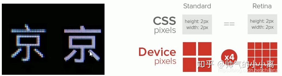
对于一张 50px * 50px 的图片,在手机 Retina 屏中打开 按照原本的物理像素比会放大倍速 这样会造成图片模糊
通过使用二倍图,提高图片质量 解决在高清设备中的模糊问题。
示例:
1
2
3
4
5
6
7
8
9
10
11
12
13
14
15
16
17
18
19
20
21
22
| <!DOCTYPE html>
<html lang="en">
<head>
<meta charset="UTF-8">
<meta http-equiv="X-UA-Compatible" content="IE=edge">
<meta name="viewport" content="width=device-width">
<title>Myself</title>
<style>
img:nth-child(2) {
width: 50px;
/*移动设备中的图片会被放大, 所以先将二倍图压缩成原图大小,从而可以提高清晰度*/
height: 50px;
}
</style>
</head>
<body>
<img src="images/apple50.jpg" alt="">
</body>
</html>
|
效果图:

3. 流式布局
流式布局是一种等比例缩放布局方式,在 CSS 代码中使用百分比来设置宽度,也称百分比自适应的布局。 流式布局实现方法是将 CSS 固定像素宽度换算为百分比宽度。换算公式如下: 目标元素宽度/父盒子宽度=百分数宽度
示例:
1
2
3
4
5
6
7
8
9
10
11
12
13
14
15
16
17
18
19
20
21
22
23
24
25
26
27
28
29
30
31
32
33
34
35
36
37
38
39
40
41
42
43
44
45
| <!DOCTYPE html>
<html lang="en">
<head>
<meta charset="UTF-8">
<meta http-equiv="X-UA-Compatible" content="IE=edge">
<meta name="viewport" content="width=device-width, user-scalable = no, initial-scale=1.0">
<title>Myself</title>
<style>
* {
margin: 0;
padding: 0;
}
section {
width: 100%;
/* max-width: 980px;
min-width: 600px; */ /*根据需要还可以设置max-width, min-width */
margin: 0 auto;
}
section div {
float: left;
width: 50%;
height: 400px;
}
section div:nth-child(1) {
background-color: pink;
}
section div:nth-child(2) {
background-color: purple;
}
</style>
</head>
<body>
<section>
<div></div>
<div></div>
</section>
</body>
</html>
|
效果图:
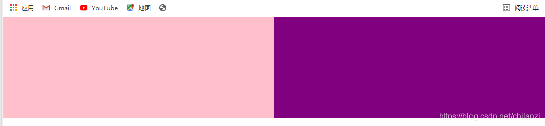
PC端
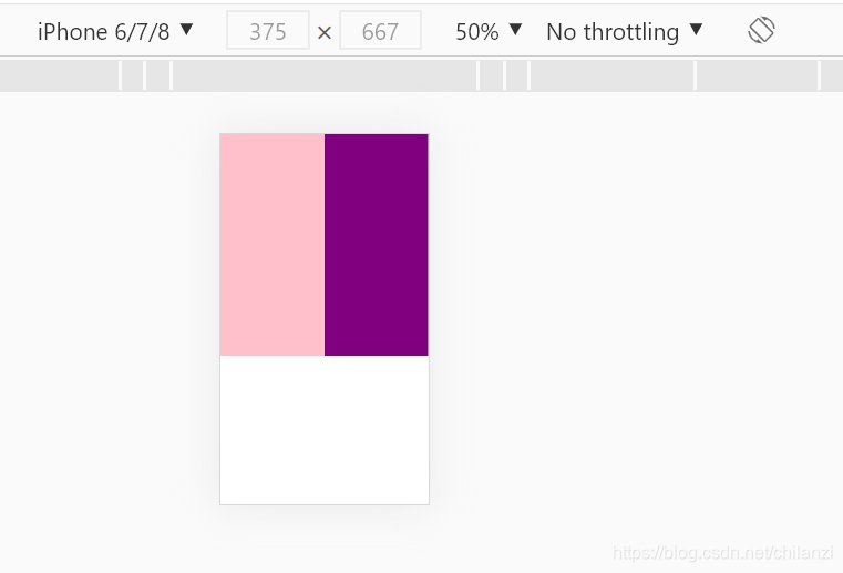
移动端
4. 特殊样式
示例:
1
2
3
4
5
6
7
8
9
10
11
12
13
14
15
16
17
18
19
| <!DOCTYPE html>
<html lang="en">
<head>
<meta charset="UTF-8">
<meta http-equiv="X-UA-Compatible" content="IE=edge">
<meta name="viewport" content="width=device-width, user-scalable = no, initial-scale=1.0">
<title>Myself</title>
<style>
</style>
</head>
<body>
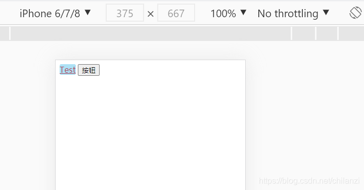
<a href="#">Test</a>
<input type="button" value="按钮">
</body>
</html>
|
1
2
3
4
5
6
7
8
9
10
11
12
13
14
15
16
17
18
19
20
21
22
23
24
25
26
27
| <!DOCTYPE html>
<html lang="en">
<head>
<meta charset="UTF-8">
<meta http-equiv="X-UA-Compatible" content="IE=edge">
<meta name="viewport" content="width=device-width, user-scalable = no, initial-scale=1.0">
<title>Myself</title>
<style>
a {
-webkit-tap-highlight-color: transparent;
/*移动端点击链接会高亮, 设置为透明色*/
}
input {
-webkit-appearance: none;
/*消除默认样式*/
}
</style>
</head>
<body>
<a href="#">Test</a>
<input type="button" value="按钮">
</body>
</html>
|